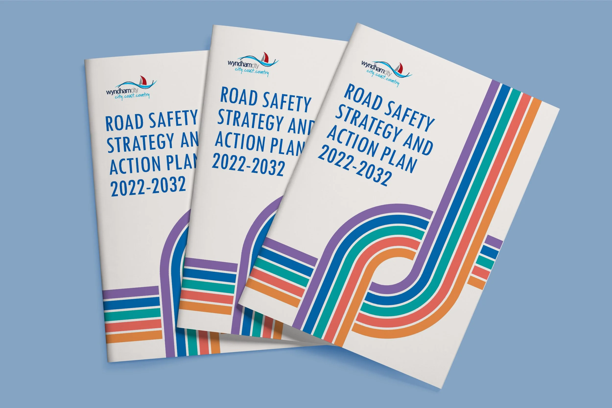
Road Safety Strategy
Date
August 2022
Category
Art Direction, Editorial, Print, Publication
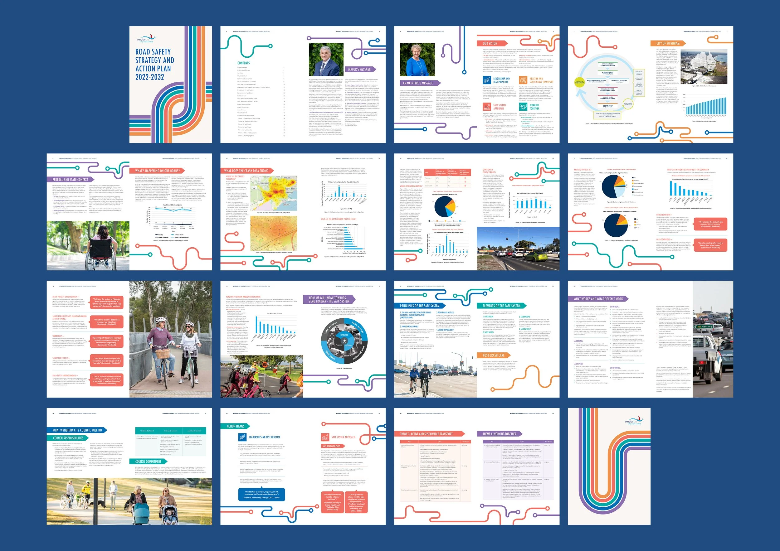
Wyndham City Council, a local government in Victoria, Australia, manages communications and governance for its residents, particularly around city improvement projects. To promote awareness and engagement in their Road Safety Strategy, the Council needed to transform a dense, text-heavy report into a clear, visually engaging brochure that could communicate important initiatives with both clarity and appeal.
The Council’s original document was comprehensive but visually overwhelming, filled with data, charts, and lengthy text. The challenge was to translate this information into an accessible 30-page brochure that would remain true to Wyndham City’s brand identity: vibrant, modern, and community-focused. The design needed to inform residents effectively while maintaining visual harmony and avoiding data fatigue.
As the Designer, I worked closely with the Creative Director to lead the visual direction, design system, and layout execution of the brochure. My focus was on creating a balance between function and aesthetics, ensuring the design guided readers intuitively, even with complex information.

Table of Contents
Infographic
I began by researching current government communication materials and contemporary brochure design trends, combining these findings with Wyndham City’s previous publications. This analysis revealed key strengths worth retaining: strong imagery, minimalist layouts, and a well-structured hierarchy.
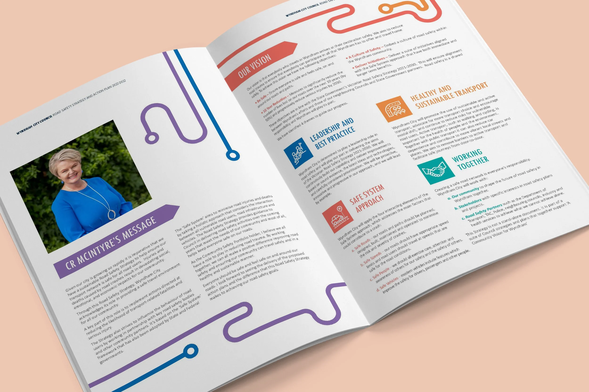
With these insights, I established the foundational pages such as the cover, table of contents, and the mayor’s message, to define the tone and flow of information. After client approval, I expanded the design system across the full document, refining both visual consistency and content pacing.
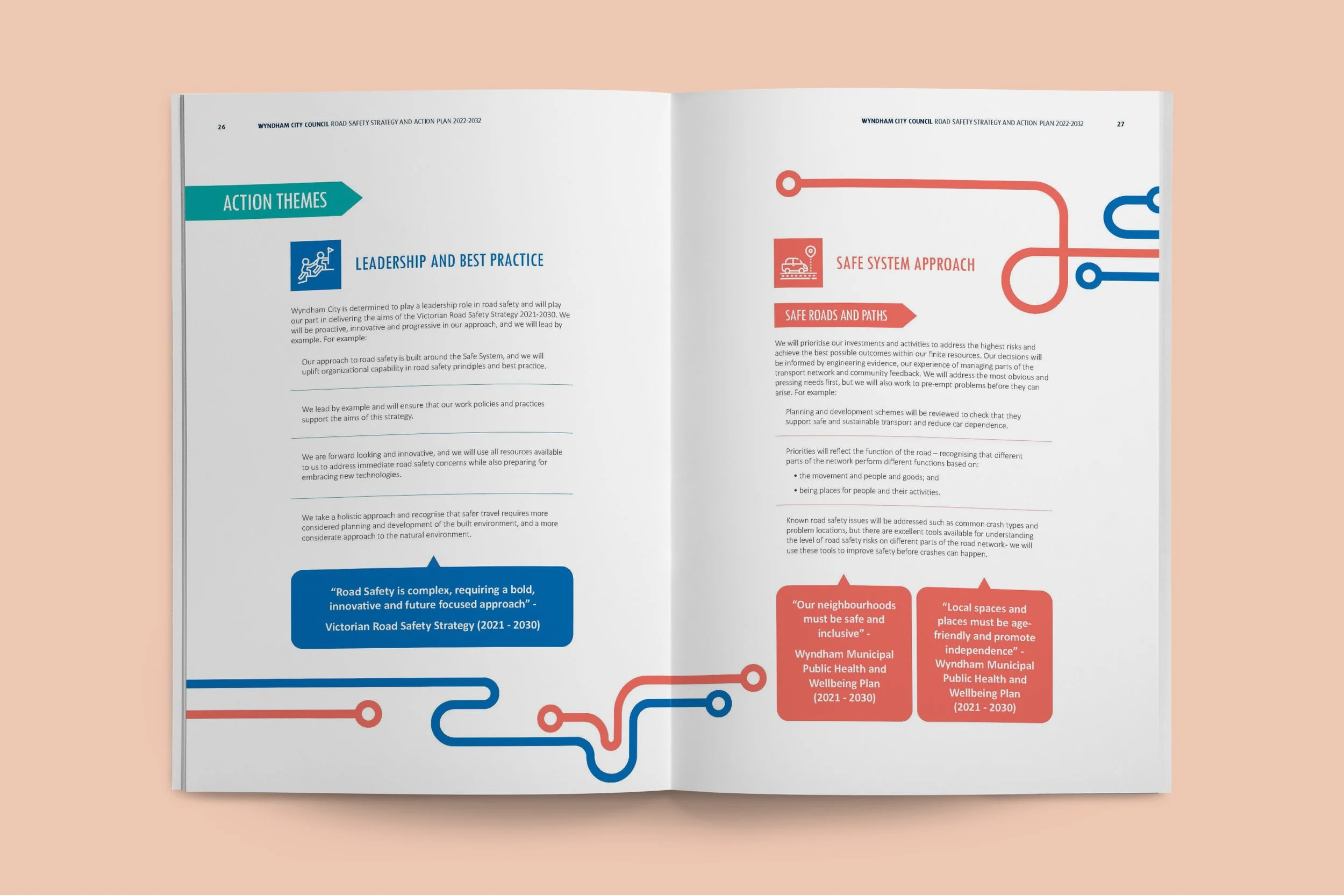
The color palette became the core of the visual language: red, yellow, teal, blue, and purple were strategically assigned to specific action plans, helping readers easily navigate sections and topics. Graphic lines inspired by roads visually connected themes of movement and safety, while san-serif typography from the brand’s identity ensured legibility and modernity.
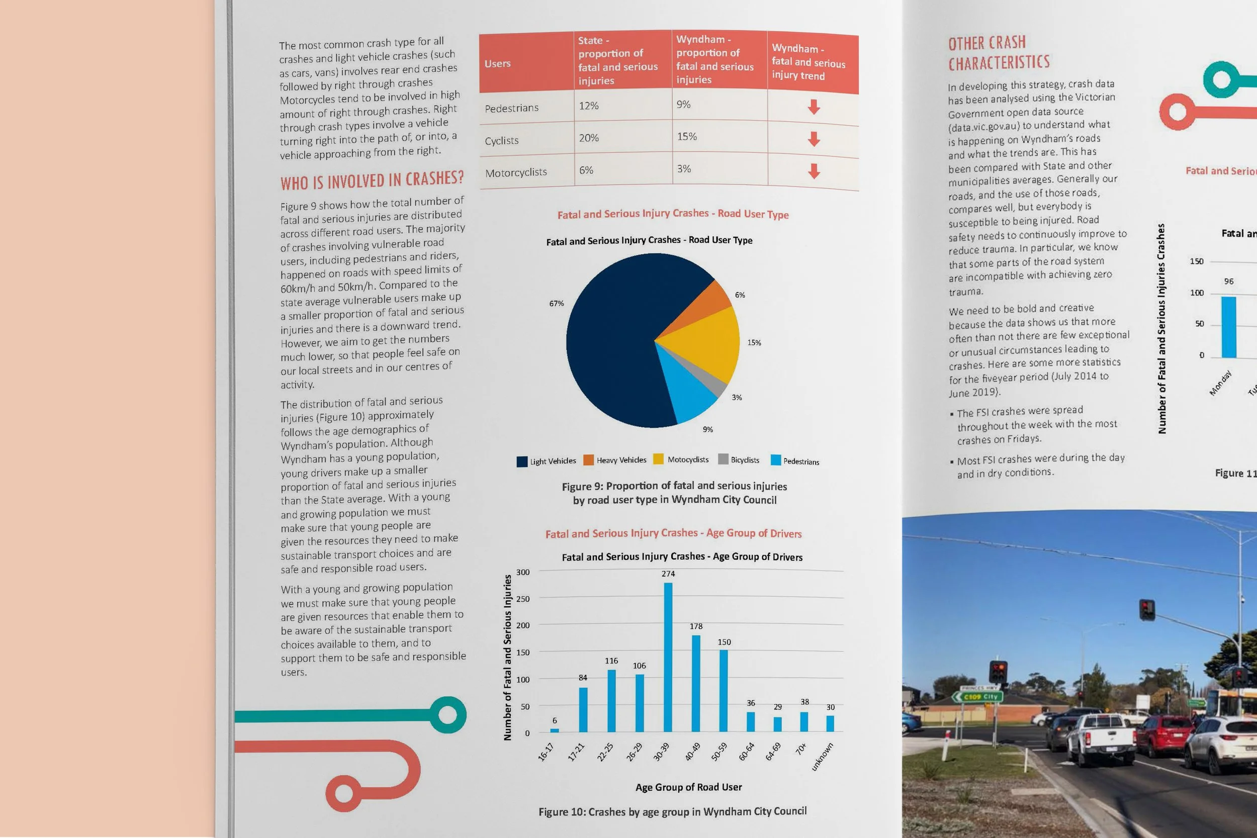
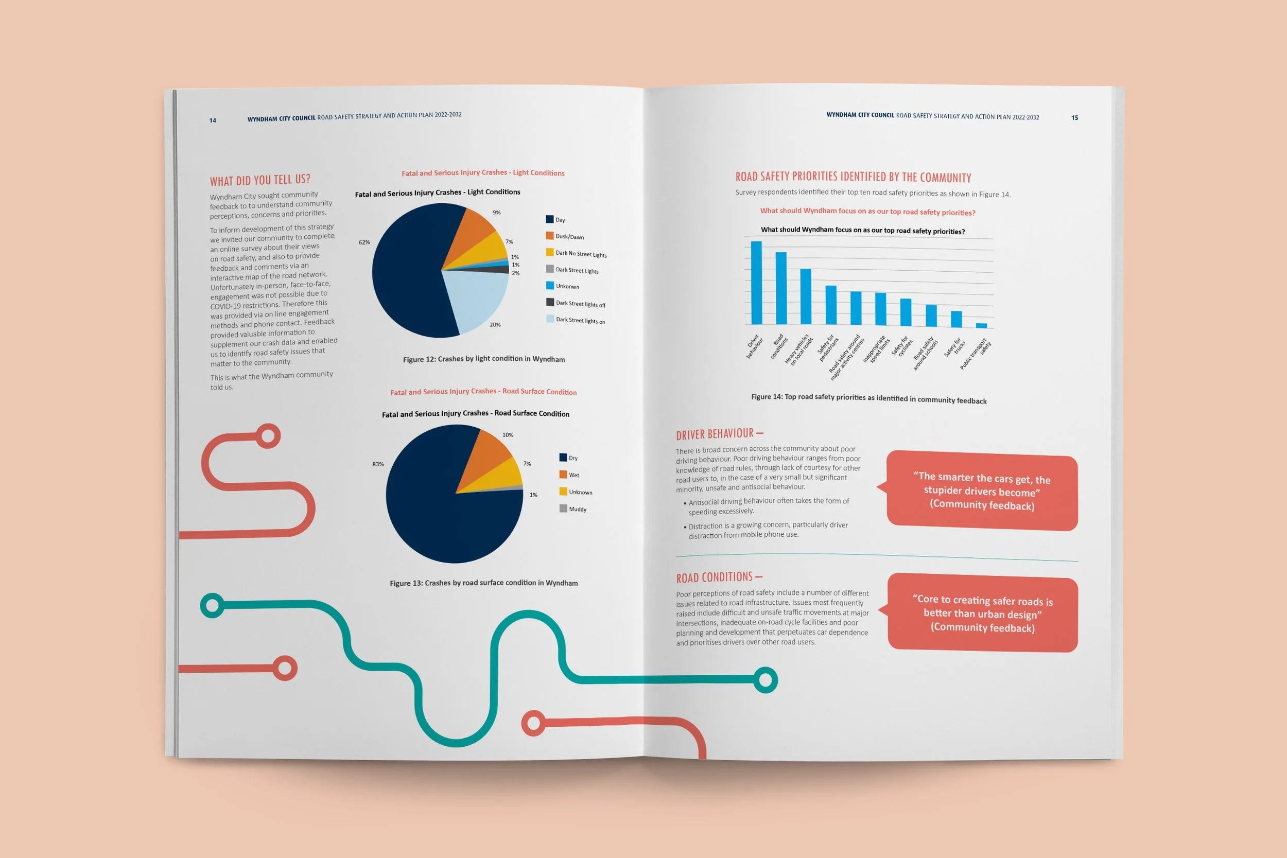
Graphs and Data
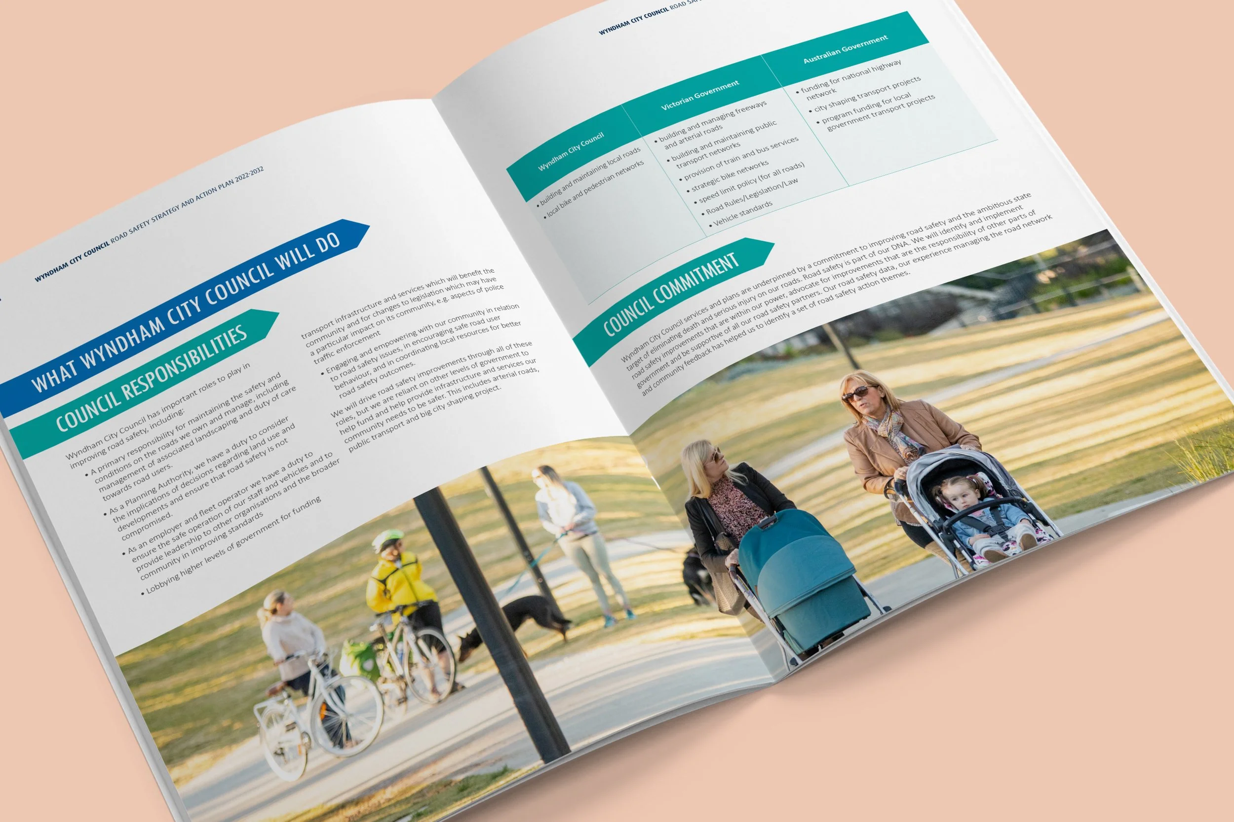
Photo Spread
Quotes and Accents
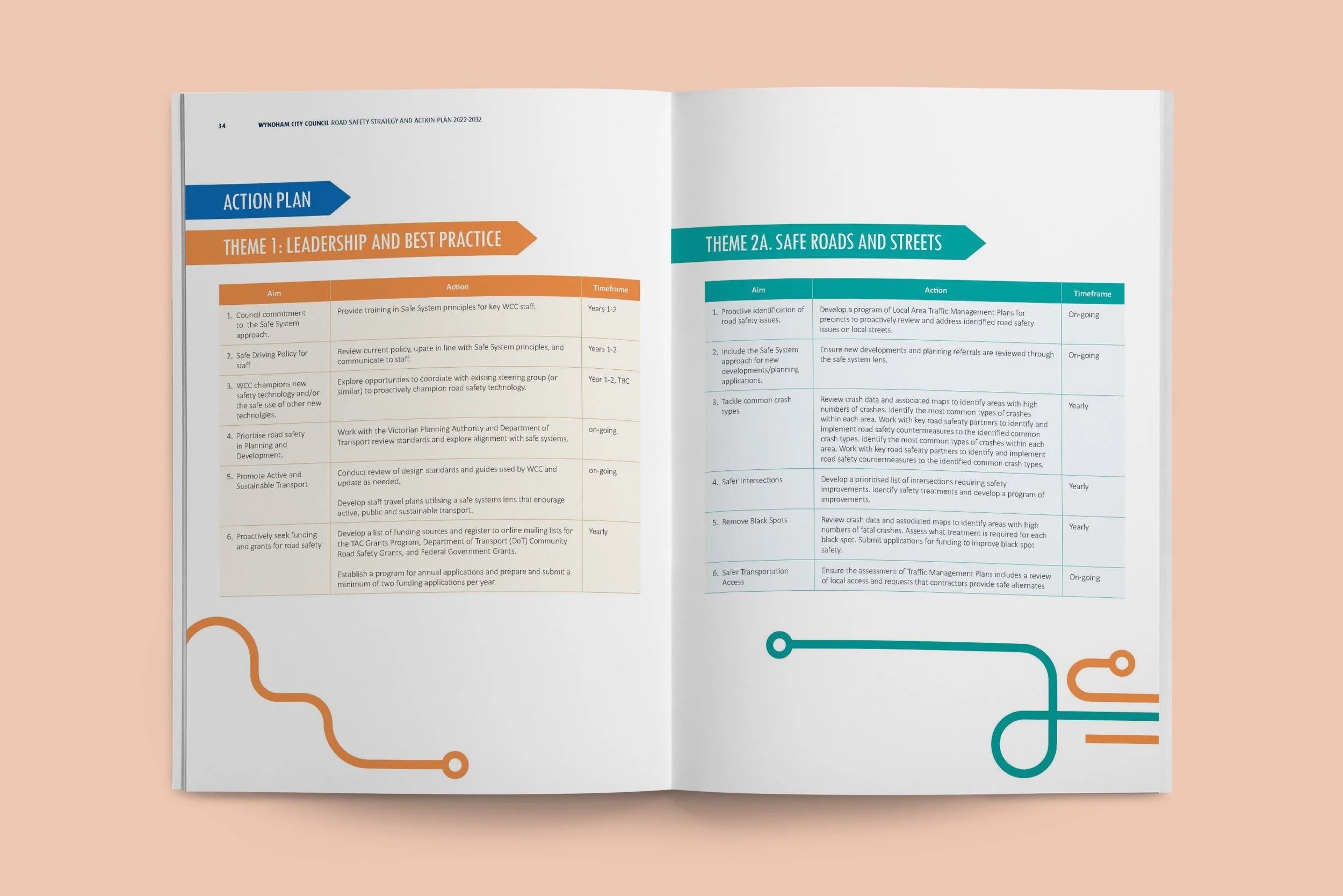
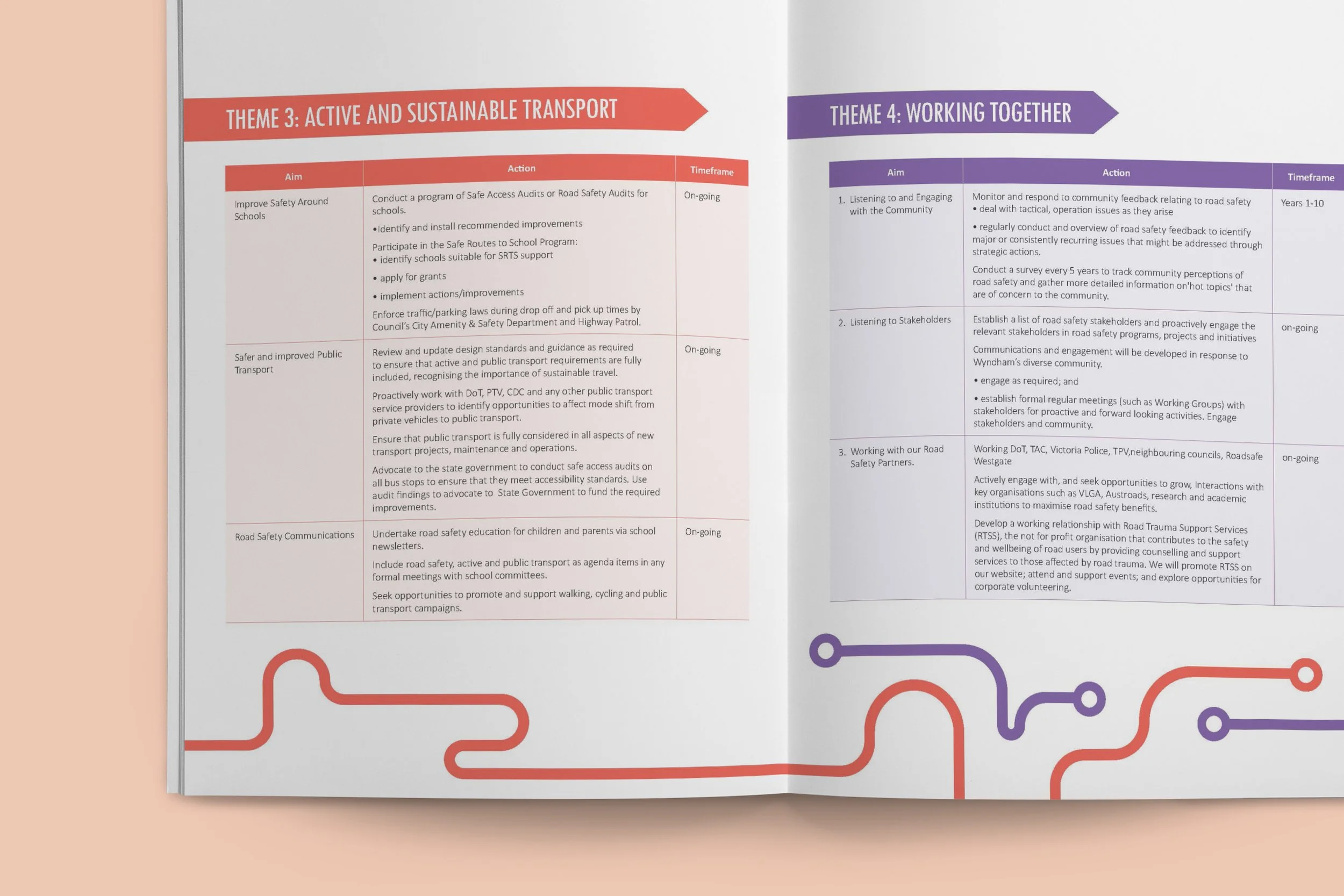
Headings and Tables
Spreads
Icons, charts, and high-quality photographs were thoughtfully integrated to break heavy text and reinforce understanding. Every design choice aimed to make the content both inviting and informative, empowering readers to grasp key safety strategies at a glance.
The final brochure successfully met the Council’s vision: a vibrant, accessible, and cohesive communication tool for residents. The publication’s clean layout and strategic use of color made it easy to navigate while keeping readers engaged throughout.
This project helped me practice design by understanding the important contents that needed to be highlighted for effective communication. Translating a very formal document into approachable visuals and layout required empathy and strategic thinking. This experience shaped how I approach communication design: balancing clarity, inclusivity, and storytelling to promote engagement and trust among diverse audiences.