
Ashtonbee
Graphic Design • Packaging Design • Amazon Listing Images • Social Media • Email Newsletter
Role: Graphic Designer
Ashtonbee is a start-up brand specializing in baby products designed to make parenting easier and safer. The company’s goal was to strengthen its brand presence and build customer loyalty through consistent, recognizable design across all touchpoints. To achieve this, we launched a year-long brand development focused on enhancing the visual identity across packaging, print, and digital platforms.
As a new brand in a highly competitive e-commerce market, Ashtonbee required a strong visual system that could distinguish its products on Amazon while communicating trust, warmth, and quality. The main challenge was to establish a clear and cohesive brand language that customers could instantly associate with Ashtonbee, both online and offline.
As the Lead Creative Designer, I was responsible for developing the brand system, defining the visual direction, and designing assets across print and digital media. I collaborated closely with the design and e-commerce teams to ensure the brand identity remained consistent and flexible across various applications.

Unfolded Packaging
Brand Categorization & Visual System
The product line is divided into five core categories—Sleep, Feed, Babyproof, Mom, and Play. Each category was assigned a unique color palette, creating a simple yet effective visual guide that helped customers quickly identify products based on their needs. This system became the foundation of the brand’s design language.
Packaging Design
The first phase focused on Amazon-ready product packaging. Each box was designed with clarity and consistency in mind, featuring key product information, brand storytelling, and a subtle background pattern derived from the Ashtonbee logo for stronger brand recall.
This approach balanced functionality with emotional appeal, ensuring the packaging communicated both trust and warmth.
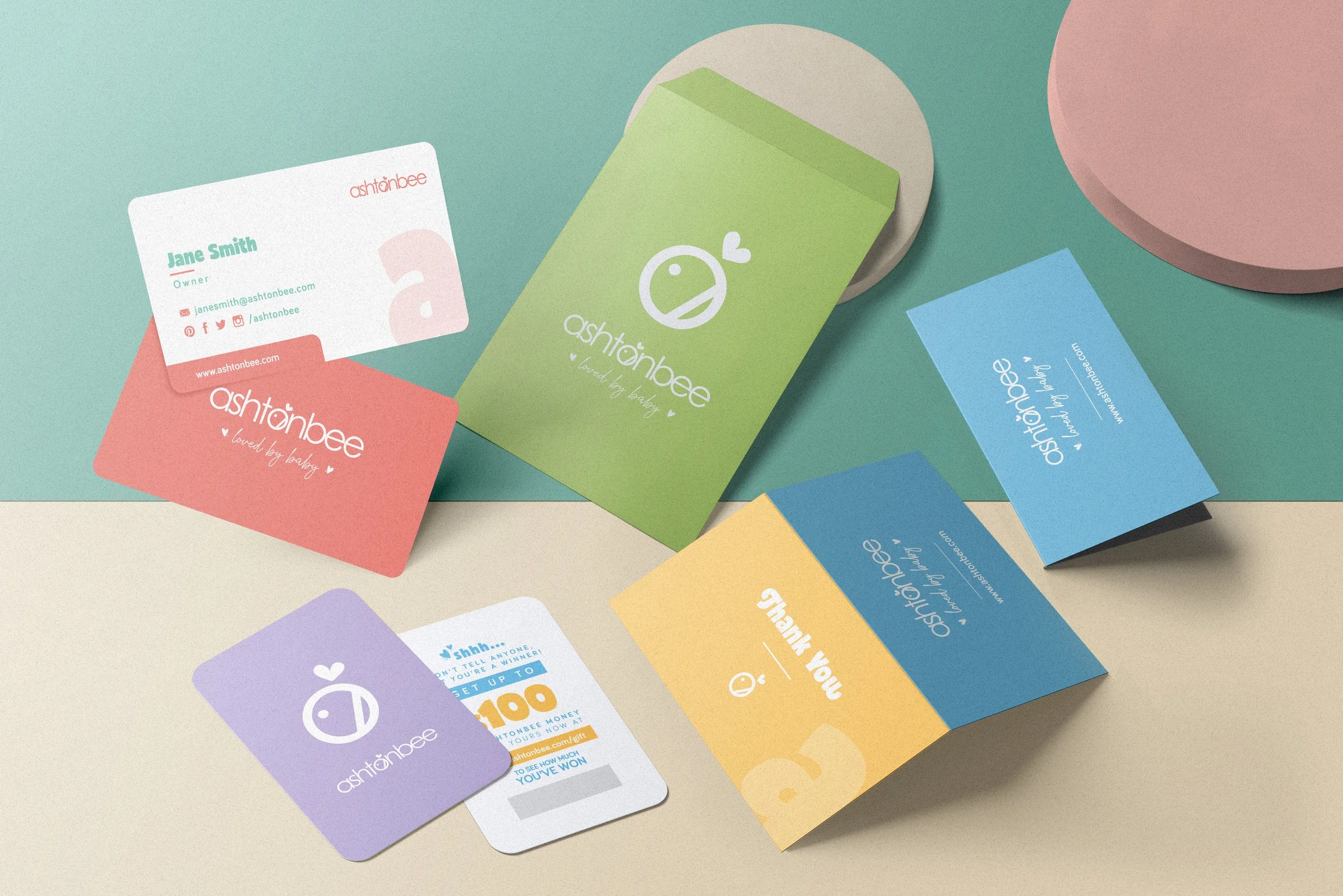
Packaging Insert Cards - Business Card, Scratch card, Thank you card, Envelope
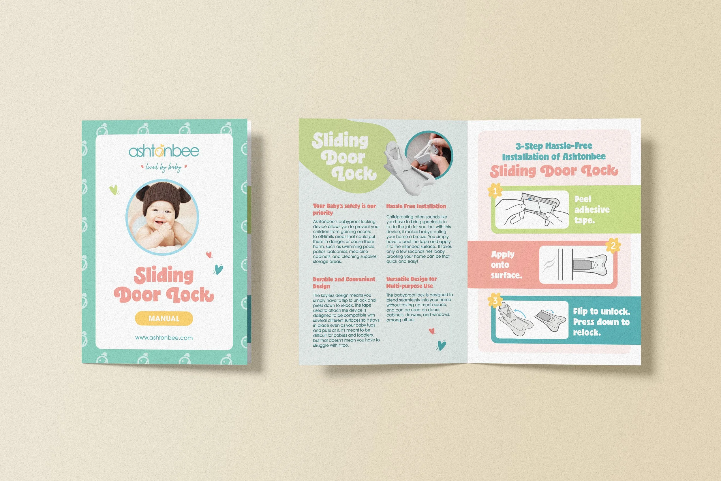
Product Instruction Manual
Print Design
Next, I designed insert cards and instruction manuals to enhance the customer’s unboxing experience. Insert cards, such as thank-you notes, vouchers, and business cards, shared a unified look, while the instruction manuals were crafted with easy-to-follow steps and clean visuals. Unlike the packaging, this stage allowed more freedom with color use, giving the materials a friendlier, more personal tone.
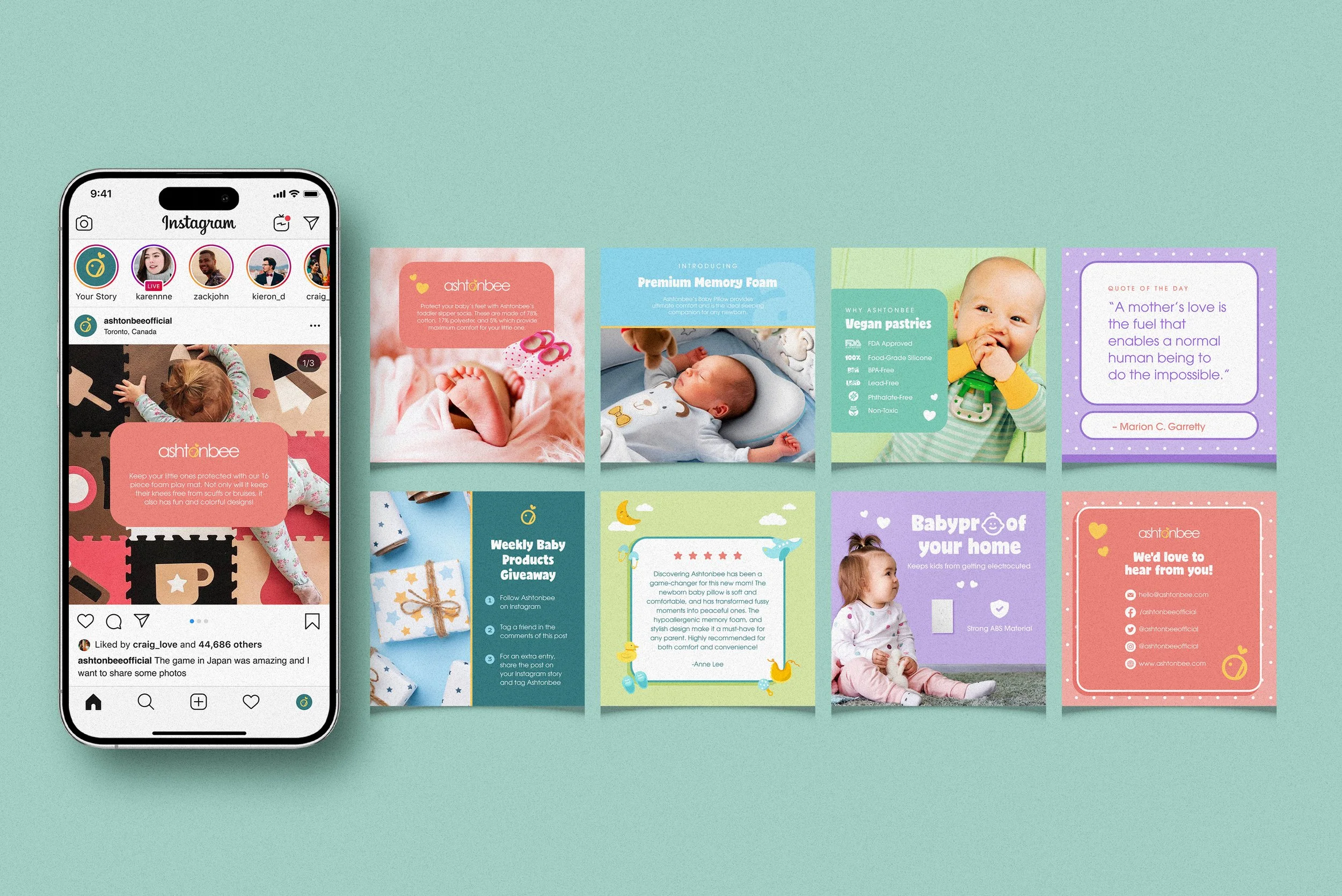
Social Media Posts
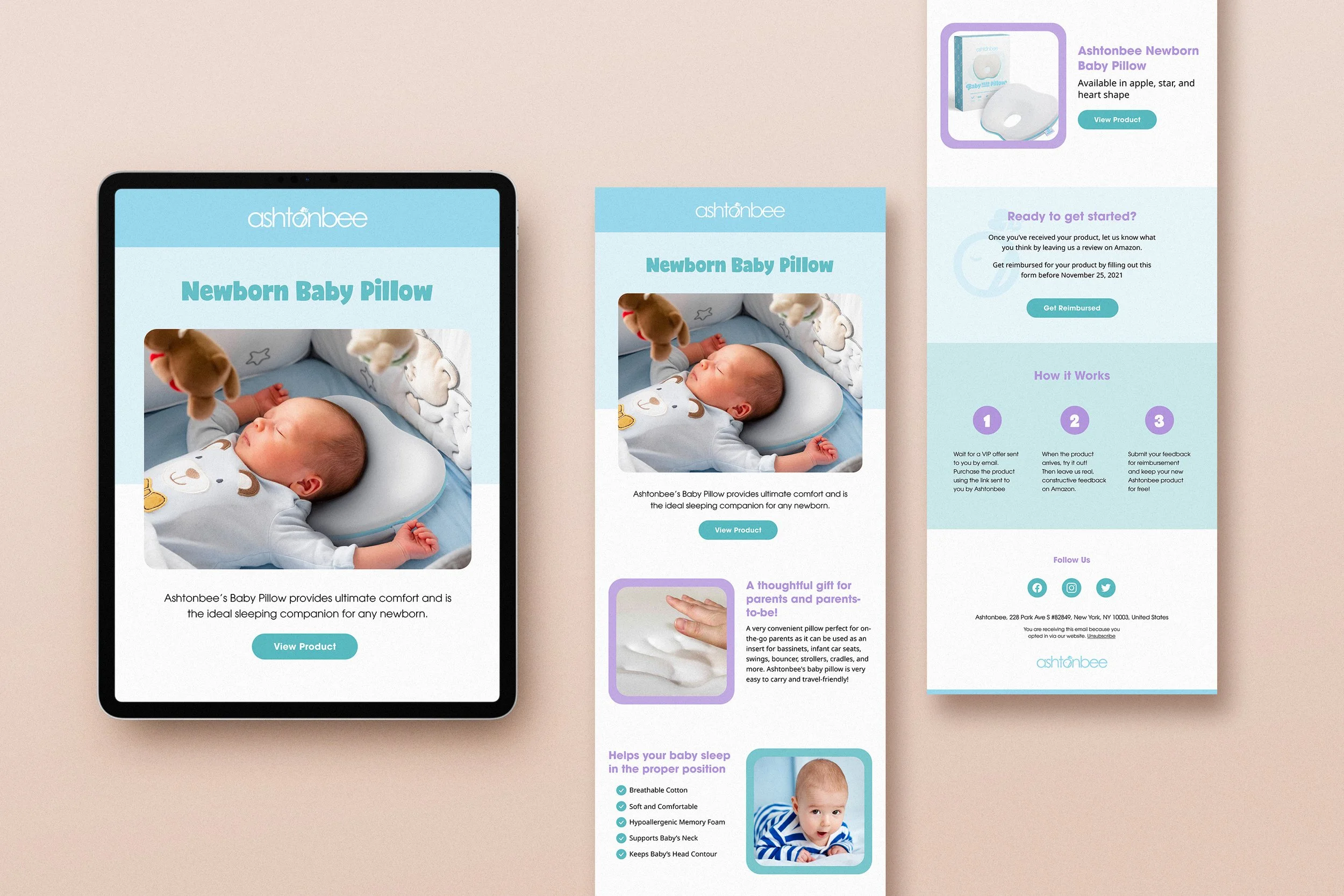
Email Newsletter
Digital Design
To expand Ashtonbee’s online presence, I created social media templates and email newsletters to strengthen engagement and brand awareness.
The templates followed a flexible grid system where each visual highlighted either a product, testimonial, or infographic. The newsletters also featured seasonal promotions and exclusive offers, designed with the same visual consistency and colorful tone established in the core identity.
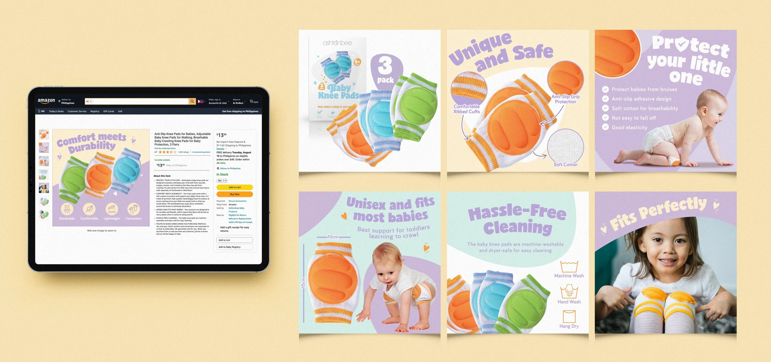
Amazon Listings - Babyproof category: Knee Pads
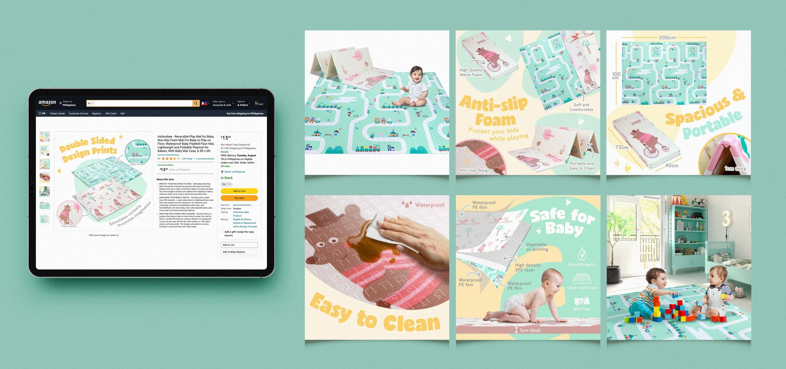
Amazon Listings - Play category: Reversible Playmat
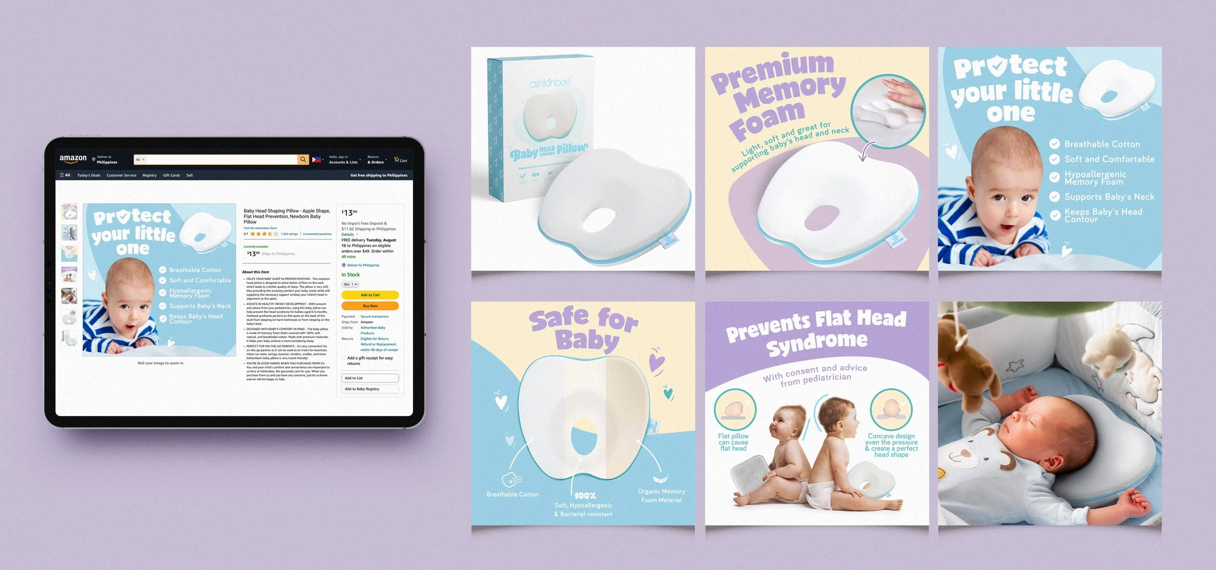
Amazon Listings - Sleep category: Head Shaping Pillow

Amazon Listings - Feed category: Dino Baby Teething Toy
Amazon Product Listings
The final phase involved standardizing Amazon product image listings across six formats: product showcase, features, benefits, dimensions, unique selling points, and lifestyle images.
A consistent layout, high-quality imagery, and refined typography helped the listings stand out in a competitive digital space, reinforcing brand trust and recognizability.
The cohesive brand system successfully established Ashtonbee’s presence in the digital marketplace, increasing customer recognition and brand loyalty. The improved consistency across packaging, print, and digital assets not only elevated the brand’s visual identity but also contributed to growth in sales and positive customer feedback.
This project strengthened my ability to build and manage a brand holistically—from strategic design thinking to hands-on creative execution. It reminded me that strong brand presence isn’t achieved by visuals alone, but through consistency, clarity, and emotional connection across every customer touchpoint.